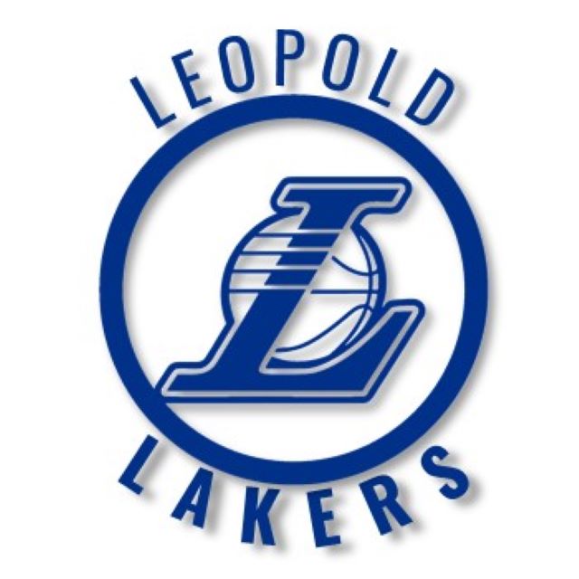
Local basketball club Leopold Lakers has revealed its new logo ahead of its 30th anniversary.
The club, which has over 300 players take to the court each week, will now sport a more streamlined, modern design that retains the general concept of its original logo.
President Jayson Newman says the change was based on the need to keep pace with an increasingly digital world.
“To celebrate our 30th anniversary it was time for our logo to be refreshed,” Mr Newman said.
“A brand refresh is essentially giving our existing brand a ‘facelift’. It’s a process of fine-tuning and evolving that aligns to our values and place within our sporting community and our identity.
“It is all about taking what exists and improving it. The primary goal is to re-energise our club.
“It doesn’t mean throwing away anything and starting from scratch. It’s refining and adapting what we already have; a shift in direction rather than a full U-turn. We’ll retain the old logo as our retro design for future potential use.”
Mr Newman said the new design’s simplified, monochrome version would be easier to reproduce and increase visibility.
“This means our logo is now clearly identifiable at smaller resolutions, such as on mobile devices,” Mr Newman said.
“Inspiration came from our existing logo, but also by looking at older versions of other circle logos from various iconic basketball teams. In the end we have produced a simple, modern interpretation of our existing Leopold Lakers logo – but moves it forward.”
Leopold Lakers have also started using the hashtag #StrongerAsOne for its social media posts, which Mr Newman said represented the unity between the club and its community.